THE NEMO LOGO
by James C. Rautio and Brian Rautio (rautio@ieee.org)
The MTT Society is starting a new conference devoted to numerical modeling for microwave and high frequency problems, NEMO, or “Numerical Electromagnetic Modeling and Optimization”. I was asked to provide a logo for the conference.
There are several critical requirements for any good logo, some of which might not be immediately apparent to those who have traveled this road before. First and foremost, a logo must be simple. Go into any store and look at the corporate logos on the products being sold. Every single one is simple. Simple in design is the first thing we notice. Logos are meant to convey a strong feeling, not a detailed message, and they must do so instantly. Simple, clean layout is an absolute requirement.
Good logos are also simple in color selection. They rarely use more than three colors, and often only one or two. A good logo is used in a wide variety of applications. Sure, lots of colors, even including gradients, works fine in a magazine advertisement and on a web page. But how about printed on the side of a bag? Lots of colors, and lots of complexity does not print well at all. And the various printing technologies for printing on fabric, as well as embroidery, simply do not allow gradients.
It is also important to choose colors that have good contrast when the logo is printed on a white background. And then there will be situations where the logo must have good contrast against a dark background. How about if it is printed in black and white, or in greyscale on a laser printer? It must also be instantly recognizable when scaled down to several centimeters in size when printed on letterhead as well as when scaled up and printed on a banner a few meters long. If there is text as part of the logo, something called “kerning” becomes important when we scale the logo to different sizes. Also, because the logo might be scaled over a very wide range, it must be created using a vector graphics tool, like Adobe Illustrator (e.g., eps files). Bit mapped graphics (e.g., jpg files) are not appropriate for scaling. Can we do these things with one logo, or do we need several versions? Under no circumstances can we let anyone and everyone start making all sorts of variations for different applications.
Even though it would not be instantly communicated to the viewer, it is also nice if a logo has a good story behind it to give depth. Hmmm. A conference about electromagnetics. To whom do you think our thoughts would jump? You’ve got it... James Clerk Maxwell!
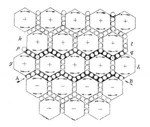
Figure 1. Maxwell’s final published attempt to develop a model of the “luminiferous æther” seems to anticipate the future discovery of internal atomic structure.
Okay, so what can we select for a graphic element that has something to do with Maxwell? Figure 1 first came to my mind. It is Maxwell’s final published attempt [1] to develop a mechanical model for the “luminiferous æther”. If light were indeed a wave, then it must, or so they reasoned, have a medium to disturb so that the wave could propagate, like a sound wave propagating through the air. By observing birefringence in crystals of Iceland Spar, they knew that light is polarized. If it is polarized, it must be a transverse wave because a longitudinal wave (like a sound wave) cannot be polarized. If this supposed luminiferous æther has any interaction at all with matter, it could not have shear strength, otherwise the earth would gradually spiral into the sun. But without shear strength, how can it possibly propagate a transverse wave? This seemed like an impossible paradox. Developing a mechanical model for this very strange material was indeed a challenge.
The model shown in Figure 1, drawn by Maxwell, shows large gears and small idle wheels. The idle wheels are needed to keep the large gears all turning in the same direction without clashing. If you read Maxwell’s description [1] of this mechanism you see that the large gears are like nucleuses of atoms and the idle wheels are like electrons. For a dielectric in the presence of a static electric field, the idle wheels are pulled out or pushed in but they spring back into place when the electric field is removed. This was Maxwell’s explanation of displacement current. If the idle wheels are free to move anywhere, we have conduction current. Maxwell strongly suspected that atoms existed because of the success of his atomic theory of gasses, but he developed this model with absolutely no knowledge of the internal structure of atoms.
There are a few problems with his model. For example, how do we explain displacement current in vacuum? And then, this is a two dimensional model. What does a three dimensional gear look like? The net effect was that Maxwell gave up on developing a mechanical model, leaving it to future scientists to puzzle out. In 1865 he published his electromagnetic theory [2] (presented orally in 1864) with no mechanical explanation what-so-ever for the equations he presented. Freedom from having to provide a mechanical explanation set the stage for all of the amazing developments of 20th century physics including quantum theory and relativity [3]. However, the complete lack of a mechanical model to support his electromagnetic theory also meant that the acceptance of Maxwell’s equations would be delayed another 23 years [4], [5]. Even close supporters and friends, like Lord Kelvin, insisted that Maxwell’s electromagnetic theory could not possibly be correct.
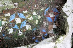
Figure 2. The floor of the entry foyer to Glenlair, Maxwell’s home, prior to renovation in 2005.
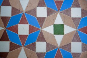
Figure 3. A close-up of Glenlair’s restored entry foyer floor seems to have been inspired by Maxwell’s model of the luminiferous æther in Figure 1.
It occurred to me that I had seen something similar to Figure 1…in Maxwell’s home, Glenlair. Specifically, I saw this pattern in the tile floor of the entrance foyer. Figure 2 shows what it looked like on my first visit in 2005. Skipping a very long story, Glenlair was in a very sad state of disrepair and threatening to collapse. It has since been repaired and restored [3], [6], [7]. A close-up of the fully restored tile floor, Figure 3, shows four colors: white, red, green, and blue. Actually the “red” is present in three brownish-red shades. But it makes one think a bit when we realize that Maxwell was the first to quantitatively determine that red, green, and blue are the primary colors of light. He even used this knowledge to create the world’s first color photograph.
Look at the pattern in the tile floor. Do you see the large gears and the idle wheels? I will go out on a limb here and speculate that Maxwell represented his mechanical model of the luminiferous æther in the pattern on that tile floor!
As you might now guess, the logo for NEMO, Figure 4, comes from that tile floor. To simplify, we cut it down to two colors. So there you have it, the logo for the new MTT sponsored conference, NEMO, inspired by a problem that Maxwell left unsolved, for us, the scientists and engineers far in his future, to ponder. While we are unlikely to find any “luminiferous æther”, I am sure Maxwell would be amazed at the problems we are indeed now solving. The logo was first used in the inaugural edition of NEMO, i.e., NEMO2014 in Pavia, Italy, May 2014. Please join us at the 2024 edition of this special event, the NEMO2024 in Montreal, Canada, and share your solutions with the world.
Figure 4. The NEMO logo is in turn inspired by the floor of Glenlair’s foyer, perhaps a secret message from Maxwell to today’s engineers and scientists.
REFERENCES
[1] J.C. Maxwell, “On physical lines of force,” Philosoph. Mag., vol. XXI, Jan–Feb. 1862. Repr. in The Scientific Papers of James Maxwell, 1890. New York: Dover, Vol. 1, pp. 451–513.
[2] J.C. Maxwell, “A dynamical theory of the electromagnetic field,” in Royal Soc. Trans., vol. CLV, 1865, pp. 459–512. Repr. in The Scientific Papers of James Maxwell, 1890. New York: Dover, Vol. 1, pp. 526–597.
[3] J. C. Rautio, “Maxwell’s legacy,” IEEE Microwave Mag., vol. 6 no. 2 pp. 46–53, June 2005.
[4] J. C. Rautio, “Twenty three years: The acceptance of Maxwell’s equations,” ACES Journal, vol. 25, no. 12, pp. 998-1006, Dec. 2010.
[5] J. C. Rautio, “The shoulders of the giants on which we stand,” 2012 IEEE MTT International Microwave Symposium Digest, WE1H-1, June 2012, pp. 1–3.
[6] J. C. Rautio, “Toby’s statue,” IEEE Microwave Mag., vol. 10, no. 4, pp. 48–60, June 2009.
[7] J. C. Rautio, “Fire! Fire! Fire!,” IEEE Microwave Mag., vol. 14, no. 4, pp. 140–150, June 2013.